Case Study7evensprong
- Project name: 7evensprong
- Products: visual identity
- Notes stay tuned for the website!
About 7evensprong
7evensprong, is a creative professional specializing in social and cultural (welfare) work. Operating at the intersection of various paths, 7evensprong provides support and assistance to individuals seeking creative solutions -- offering a range of services, including workshops on spoken word, rap, and beatboxing, as well as expertise in youth work, training, and guidance.
The Challenge
While there is an undeniable and intrinsic connection among the target audiences, finding a balance to effectively engage all of them posed a challenge. 7evensprong’s visual identity needed to invoke trust and professionalism towards welfare agencies, communicate understanding towards challenged youth while creating an atmosphere that resonates with the imaginative and out-of-the-box-thinking creatives.. Bringing all of these elements together felt like solving an intricate puzzle!
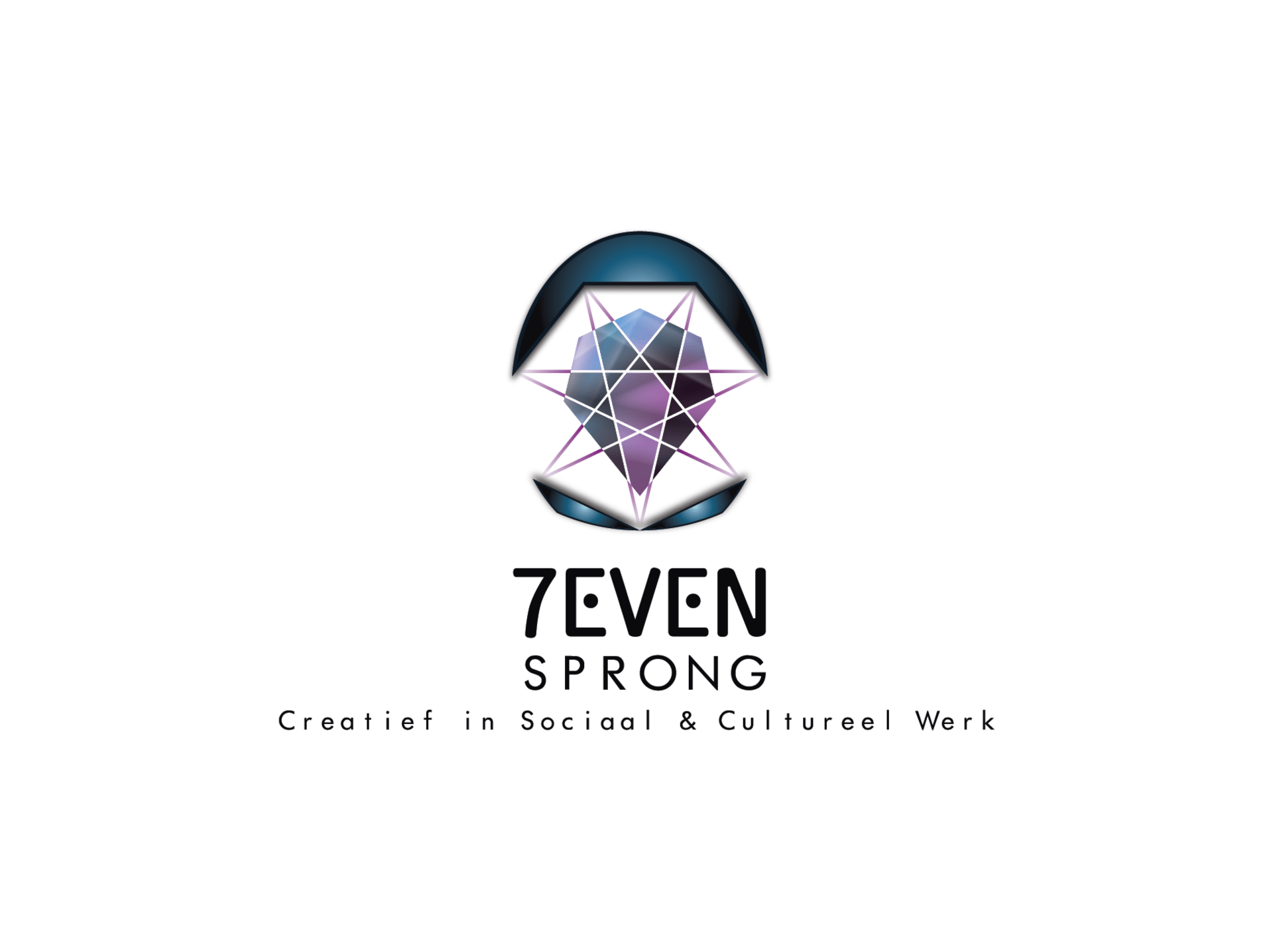
Logo design explained
Geometry played a crucial role in crafting a logo that made a powerful visual impact and resonated with viewers on an intuitive level. To begin, we integrated a heptagram into the design, which is a geometric shape formed by connecting seven points with seven lines or line segments. This heptagram symbolically representing the seven disciplines offered by 7evensprong's services.
7 (Zeven) - “Seven” The number 7 holds significant importance in representing the essence of the business: Zeven ("Seven"/7), which is the surname, carries rich symbolism in mythology (self-awareness, inner wisdom, self-mastery), and encompasses the diverse categories of disciplines offered.
We started arranging the heptagram along with other geometric shapes on a grid, experimenting with different combinations. Incorporating the heptagram into the face was an obvious choice as it symbolized the number seven in the 'mind.' However, something was still lacking. That is, until this crystal shape emerged from the heptagram - the missing piece we had been searching for. Its intricate form represented both the complexity of the brain and the clarity of a crystal.
Designed products
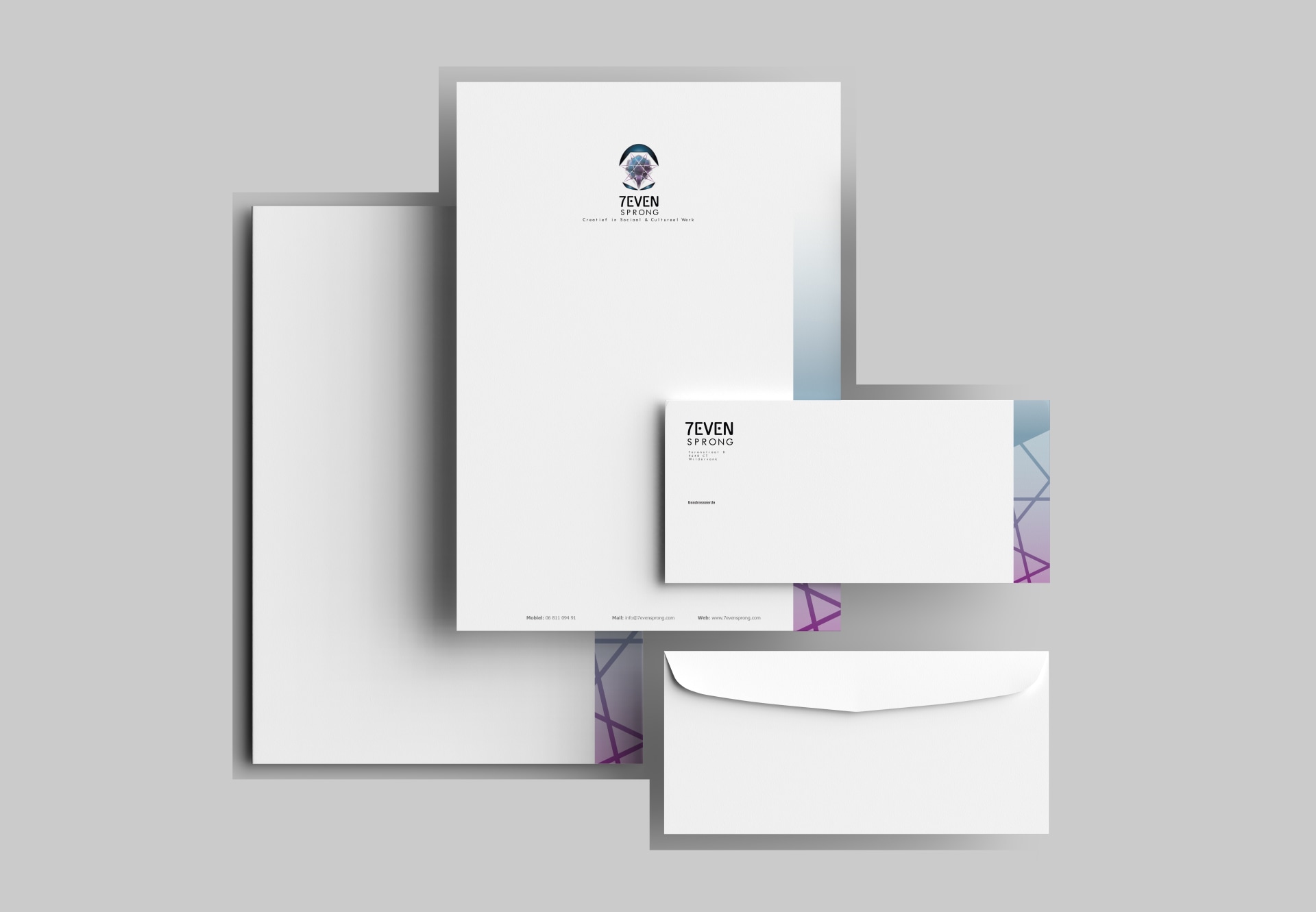
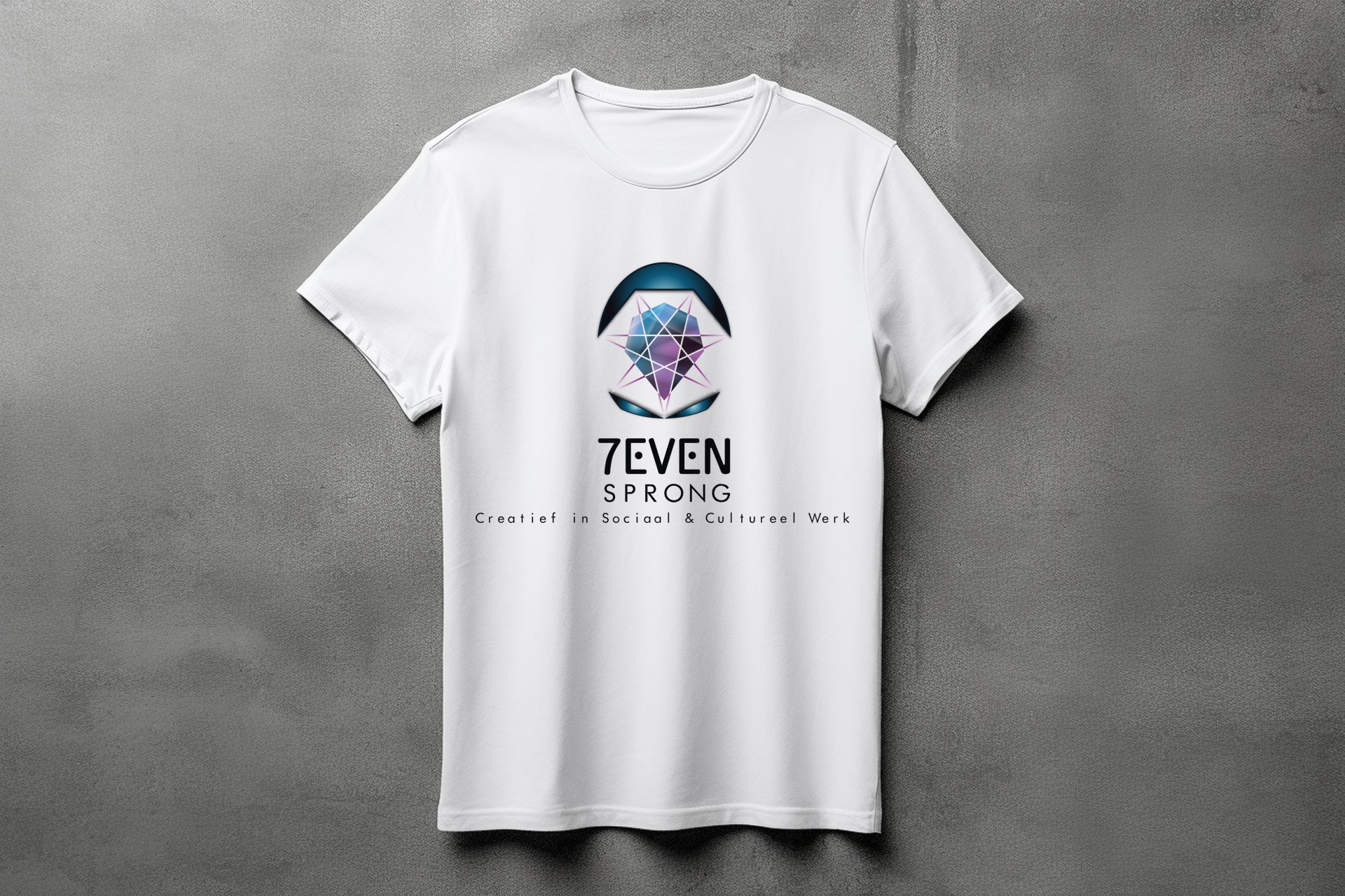
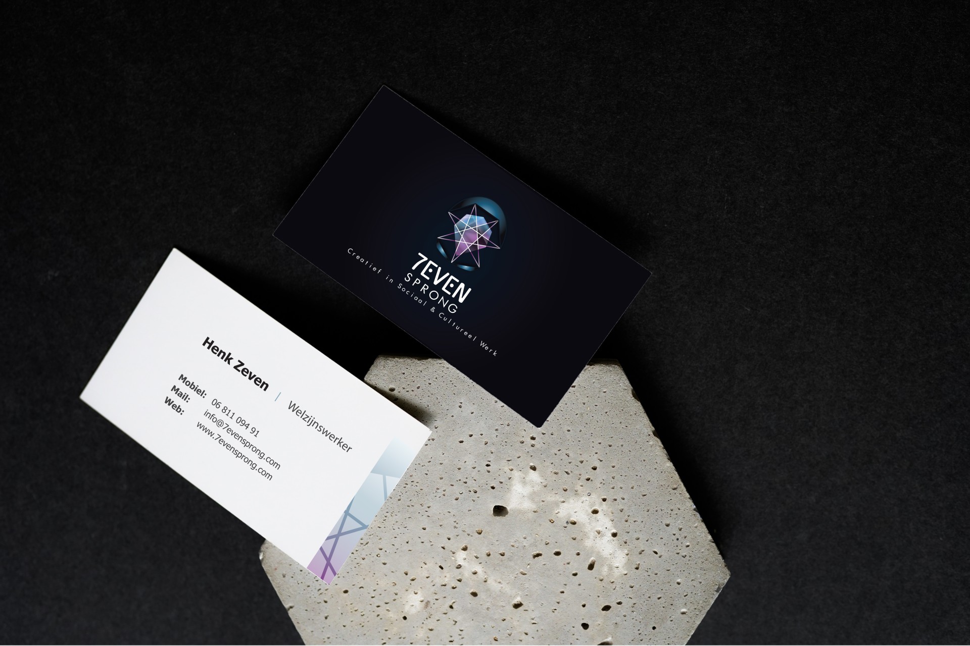
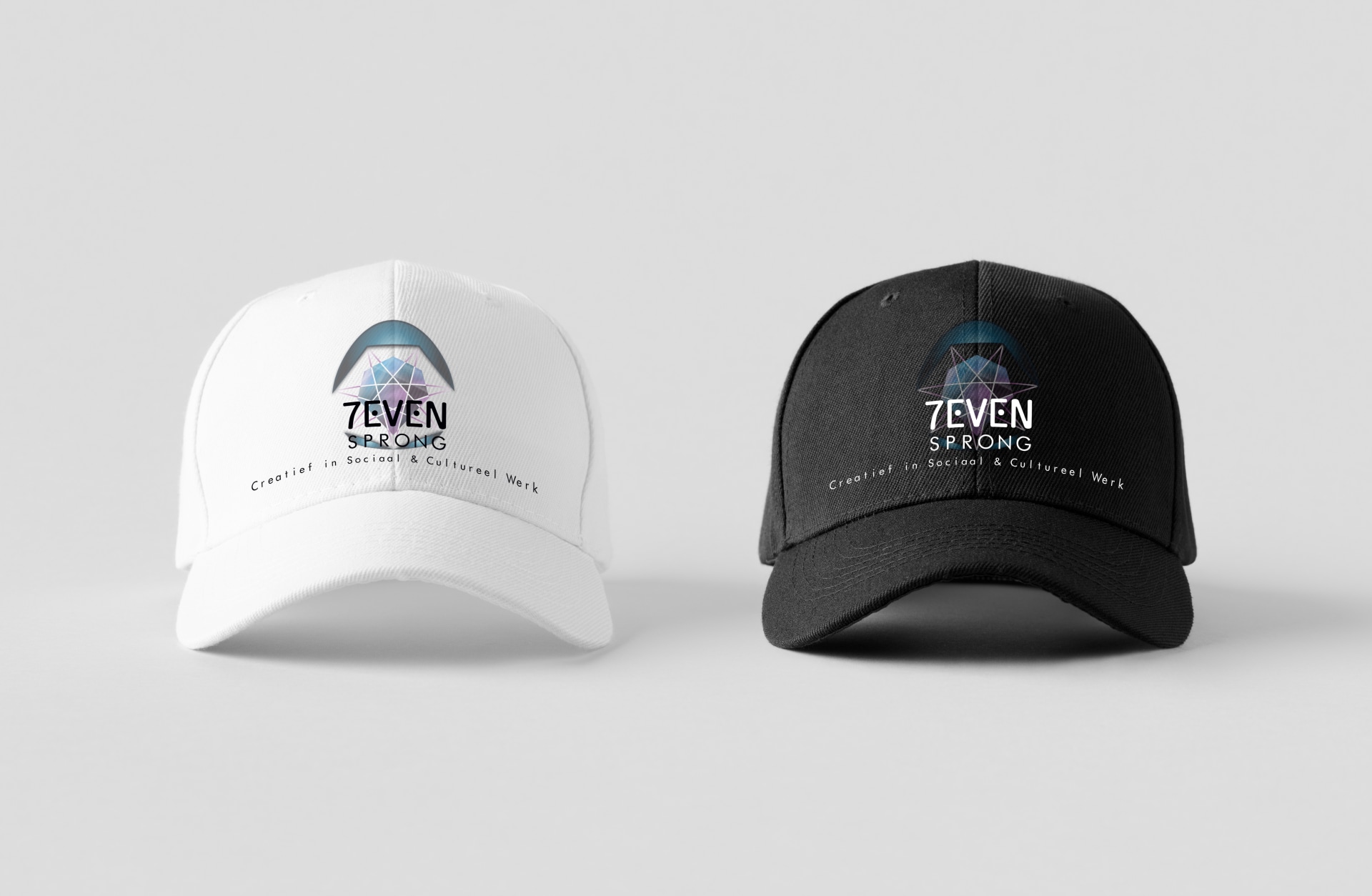
The project encompassed a range of elements including logo design, business cards, business letter layouts, envelopes, and merchandise. Stay tuned for the website!
7evensprong Concluded
The visual identity we crafted for 7evensprong is designed to make him stand out from his peers, showcasing his unique personality and entrepreneurial vision! We believe this will establish him as a strong brand and business, clearly communicating what he stands for.
May he thrive in his endeavors!
